Walmart - CMS Page Designer (Tempo)
Walmart - CMS Page Designer (Tempo)
Walmart - CMS Page Designer (Tempo)
Enable site merchants to design a page within Walmart’s content management system (Tempo) to reduce complexity and inconsistent process and to reduce time spent on designing a page by 25%-50%.
Enable site merchants to design a page within Walmart’s content management system (Tempo) to reduce complexity and inconsistent process and to reduce time spent on designing a page by 25%-50%.
Enable site merchants to design a page within Walmart’s content management system (Tempo) to reduce complexity and inconsistent process and to reduce time spent on designing a page by 25%-50%.
Role
Role
Role
Lead UX Designer
Lead UX Designer
Lead UX Designer
Output
Output
Output
Overall Flow, Prototypes, Figma
Overall Flow, Prototypes, Figma
Overall Flow, Prototypes, Figma
Duration
Duration
Duration
20 months
20 months
20 months


Hypothesis
Hypothesis
Hypothesis
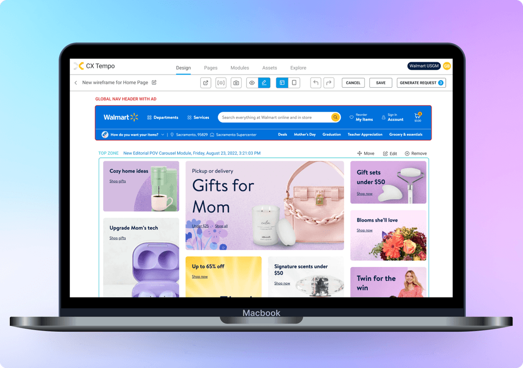
Non-visual content management for campaigns is more difficult than visual. By introducing WYSIWYG capability, we can reduce time spent on page design and management for campaigns by ~25% and increase user satisfaction.
Non-visual content management for campaigns is more difficult than visual. By introducing WYSIWYG capability, we can reduce time spent on page design and management for campaigns by ~25% and increase user satisfaction.
Problem
Problem
Problem
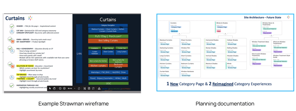
Site Ops use ad hoc and cumbersome processes to create page design wireframes. This includes using cobbling together designs using PPT or XLS, then take a screenshot to send for approval and Creative reference.
Historically, curation and management of marketing content on Walmart.com was managed collaboratively by Site Merchant and Category teams. Each vertical had its own unique content process for analyzing, developing, wireframing, reviewing, approving, requesting assets, and building modules.
Today’s workflow
The page creation process in Walmart’s Site Merchandising team today relies on:
Inadequate/inaccurate tools (Excel, Powerpoint) for wire framing
Duplication of tasks
Manual copy/paste that could be automated
Tribal knowledge and lack of standardization
Today’s workflow
The page creation process in Walmart’s Site Merchandising team today relies on:
Inadequate/inaccurate tools (Excel, Powerpoint) for wire framing
Duplication of tasks
Manual copy/paste that could be automated
Tribal knowledge and lack of standardization


Solution
Solution
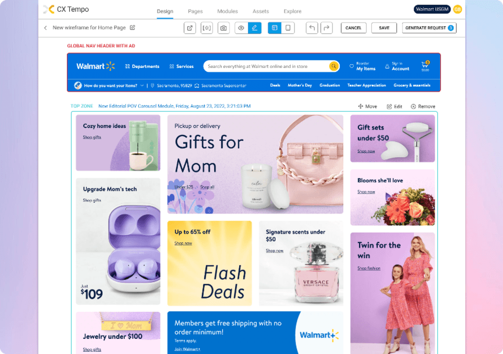
Working with my product and engineering partners, I proposed a solution that enables users to plan and design their page visually for greater accuracy and time savings. Working with three design principles, I did the following:
Use an interface that users are already familiar with. Plan and design their page online with a “WYSIWYG” solution that integrates with existing internal tools.
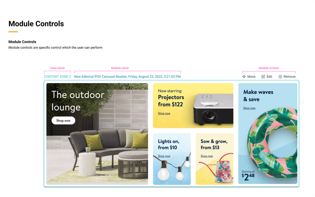
Design an interface that allows for easy editing where users can move modules to visualize their page.
Save users time by eliminating the need to plan and design in an siloed environment potentially 4-14+ hours’ savings/page
Working with my product and engineering partners,
I proposed a solution that enables users to plan and design their page visually for greater accuracy and time savings. Working with three design principles, I did the following:
Use an interface that users are already familiar with. Plan and design their page online with a “WYSIWYG” solution that integrates with existing internal tools.
Design an interface that allows for easy editing where users can move modules to visualize their page.
Save users time by eliminating the need to plan and design in an siloed environment potentially 4-14+ hours’ savings/page




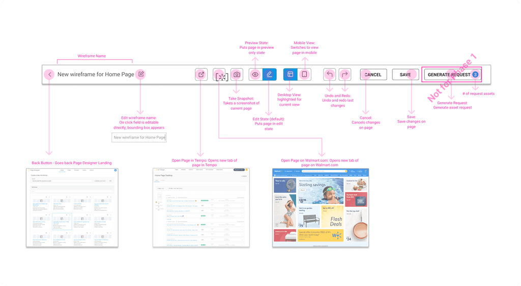


User testing and feedback from MVP
User testing and feedback from MVP
To gather insights, I collected user feedback provided by a select group of site merchants who could interact with the conceptual prototype I created.
Here is what I discovered:
Users perceived this concept as a “leaps and bounds” improvement from the current workflow
Visually, it helps users and all stakeholders better plan, curate and communicate. It also prevents mistakes/reworks by bringing in module specs/capabilities into the wireframe.
This approach would only be for planning and designing and would still require some manual processes but would reduce the number of steps to complete a task.
This research helped me evaluate the usability of the prototype and determine whether this approach aligns with our goal of enabling a more seamless planning and designing experience.
Don Bambico
Copyright 2025 by Don Bambico
Don Bambico
Copyright 2025 by Don Bambico
Don Bambico
Copyright 2025 by Don Bambico